

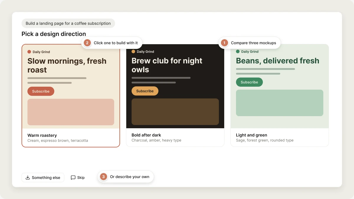
- shows three design directions, rendered as mockups of your product, for you to pick from,
- asks a short design question about one aspect of the look, such as a palette or a font pairing, or
- builds directly when your prompt already pins down the look.
Key benefits
- See before you build. Compare three rendered mockups of your own product before committing to one.
- Directions written for your brief. A bakery, a finance dashboard, and a kids’ learning app get different directions, not the same three templates.
- The build matches what you picked. Vibely reads the colors and fonts off the mockup you chose and builds with them.
- Works for web and mobile. Web projects get page mockups. Mobile projects get phone screens.
Design directions
Design directions show three different visual approaches for your project before the full build starts. For each direction, Vibely writes a short art-direction brief for the product you described, naming the feeling, the palette, the type, the layout, and one signature detail, often with a real brand or publication as a reference. It then renders each brief as a mockup of your product, so you compare real layouts, typography, and color side by side.When design directions appear
Design directions appear on a first build when the look is open, meaning your prompt describes what to build but not how it should look. They’re most common for projects with a strong visual surface, such as:- Landing pages and marketing sites
- Storefronts
- Portfolios and blogs
- The first screens of a mobile app
How to use design directions
1
Describe your project
Write a prompt for what you want to build. Keep it high-level about the look if you want a wider range of directions.
2
Compare the three directions
The directions appear in the question card in the project chat. Scroll through them, or click the expand button on a direction to see its mockup full size.
3
Pick one
Click a direction, or click Select in the full-size view. To describe a look of your own instead, choose Something else and type it. To let Vibely decide, choose Skip.
4
Vibely builds with it
Vibely takes the palette and fonts from the mockup you picked, and the brief behind it, and uses them for the full build.
Mobile projects
In mobile projects, each direction is rendered as a phone screen, with a status bar, a real first screen of your app, and a tab bar, so you judge the look at the size it will actually be used. The chosen colors are written into your app’s light and dark themes, and the chosen typeface is installed and loaded for you. See A worked mobile example.Design questions
When only one part of the look is open, or you ask about one part, Vibely asks a single design question with visual options instead of three full mockups:- Color palette: swatch strips of the colors each option would use
- Typography: each font pairing previewed in its own typeface, heading and body
- Layout: simple wireframe thumbnails of each layout option
When Vibely skips design guidance
Vibely builds directly when the look is already decided. This includes prompts that:- name colors, fonts, or a brand,
- reference another product or style directly,
- include a URL to build from,
- attach a mockup, screenshot, or other reference image.
Steer the design after the first build
Selecting elements keeps a change focused. It doesn’t rethink the app’s overall design.
For a rule that should hold on every later message, add it to knowledge, for example “Never use purple. The brand accent is #1F7A5C.”
A worked mobile example
A direction lands in different places on a phone than on the web:1
The palette lands in the theme, not CSS
React Native has no CSS. The direction’s colors are written into both the light and dark themes in
src/constants/theme.ts, restyling the existing color tokens rather than adding new ones. Screens read the theme, so they update together.2
The color reaches the app icon and splash screen
The splash screen and Android adaptive icon background use the direction’s color, alongside a real app icon.
3
The typeface is installed and registered
Vibely installs the font family and registers each weight the design uses. The splash screen stays up until the fonts load, so there’s no flash of the wrong font.
Limitations
- Mockups use placeholder content. They show the look, not your final copy. The build writes content for your app.
- Generating directions takes a little time before the build starts, usually well under a minute.
- Directions are for the first build. Later changes to the look happen through prompts and Edit from the preview.
FAQ
What if I don't like any of the three directions?
What if I don't like any of the three directions?
Choose Something else and describe the look you want, or pick the closest direction and refine it after the first build.
Can I combine elements from different directions?
Can I combine elements from different directions?
Pick the closest direction, then ask for the change after the first build, for example “Use this layout with the warmer palette from the second option.”
Can I bring my own fonts and colors?
Can I bring my own fonts and colors?
Yes. Name them in your prompt and Vibely skips the directions and uses them. For rules you want applied to every project, add them to workspace knowledge.
Does this work for dashboards and internal tools?
Does this work for dashboards and internal tools?
Design directions focus on surfaces where the look matters most, such as landing pages, storefronts, and portfolios. Dashboards and internal tools usually go straight to the build, though Vibely may ask a single question about the palette or layout.
Related topics
Edit from the preview
Point at what to change on the page.
Design systems
Reusable design rules for your workspace.
Build from a URL
Use an existing site as a design reference.
Prompt library
Prompts for common design styles.